As a low vision user of an Apple iPhone, I was very excited when I heard about Dynamic Type being included in iOS 7. As soon as it came out I immediately tested it out and was both disappointed and pleased. Dynamic type works great in most applications but utterly fails in others. Also, many parts of iOS 7 totally ignore Dynamic Type and worse, many high-profile apps opt-out of including this functionality.

This is a picture of the Notes app using Dynamic Type. As you can see, it is using very large text for the List View. You will also notice that iOS has a tendency to cut text off if it’s too big to fit in its allocated space. Another disappointing aspect of Dynamic Type is that the buttons on the app as well as the Status Bar Items all appear at their default small size. Turning on Dynamic Type does not increase the size of all elements on iOS 7, just particular parts of apps such as List Views and Edit Fields.
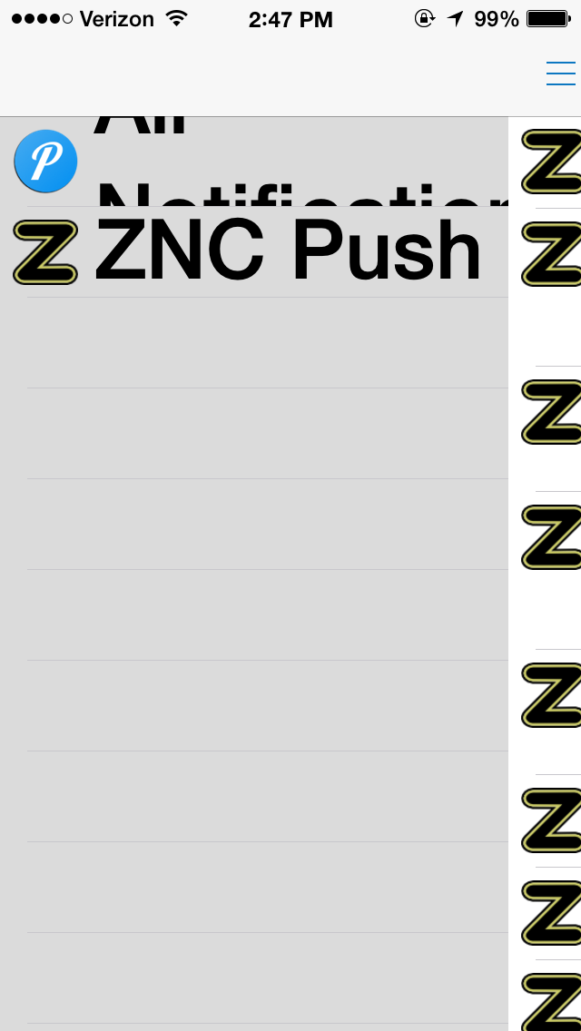
Dynamic Type also has numerous problems rendering text properly in certain circumstances. This becomes more apparent as we start exploring other apps. Here’s a picture of an app I recently downloaded called Pushover. It can take input from various sources and give me Push Notifications about them. For example, you can be sent a Push Notification if your home automation system detects that someone just turned on the light. The sump pump can send you an alert if the basement floods. If someone in the chat room mentions your name your phone will bleep at you. This app has a lot of potential but the developer messed up on the UI a bit. As you can see, the text is too big to fit within the defined space allocated by the developer.
This problem can be alleviated by decreasing font size until text fits properly on the screen. To do this, go to Settings, General, Accessibility, Text Size. Grab the slider and move it until you’ve found the middle-ground between viability and functionality.
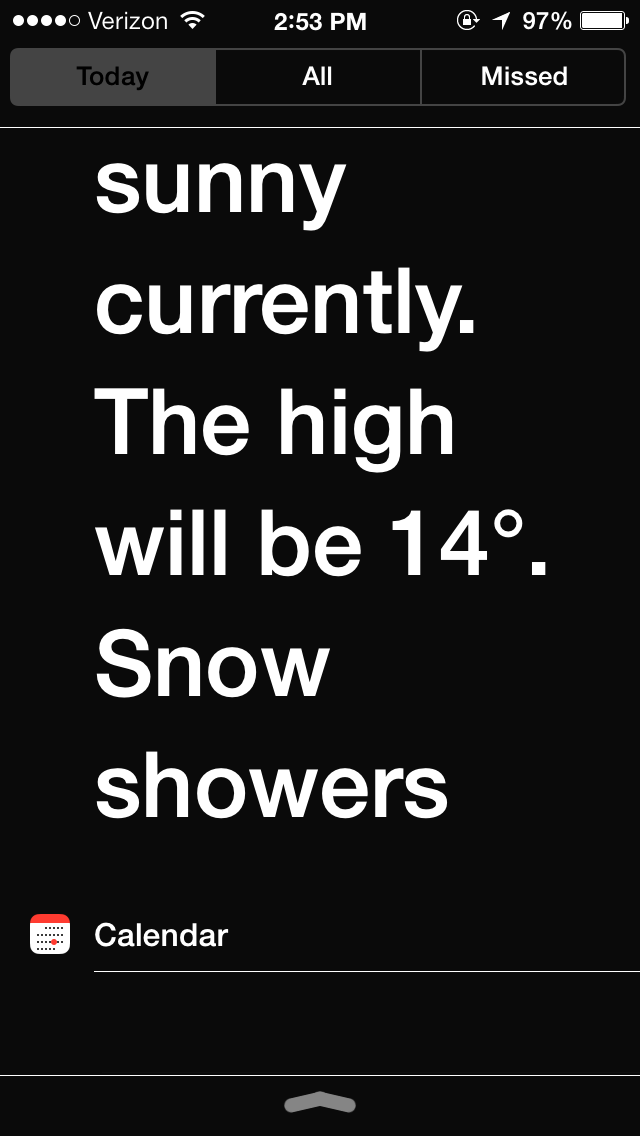
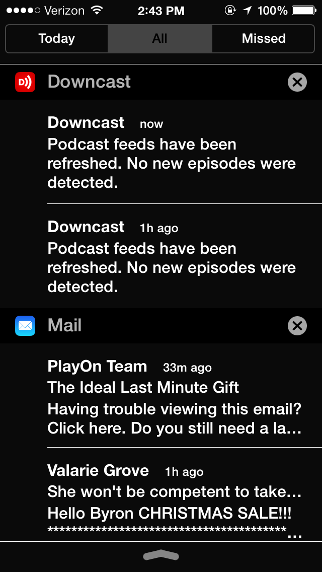
The Notification Center deals with Dynamic Type in a really weird way. On the left there’s a picture of the Today tab, you’ll notice that the text is nice and big. On the right, we have the All tab and the text is the default small size. Hey Apple… WHAT GIVES!? I for one find the inconsistency highly annoying. By the way, do try to ignore the Viagra spam in the picture on the right! 🙂
You will find the same inconsistency throughout the entire iOS infrastructure. It is almost as if Apple patched this feature in as an afterthought. I am really hoping that as newer versions of iOS become available we will start seeing improvements on these kinds of features.
Recently Apple has started taking accessibility very seriously but most of their work has been centered on people who are totally blind or those who prefer text-to-speech. The zoom feature also helps many of us who are partially sighted but it’s not my favorite way of using a device. I really prefer using a feature like Dynamic Type, even if it’s not completely usable.
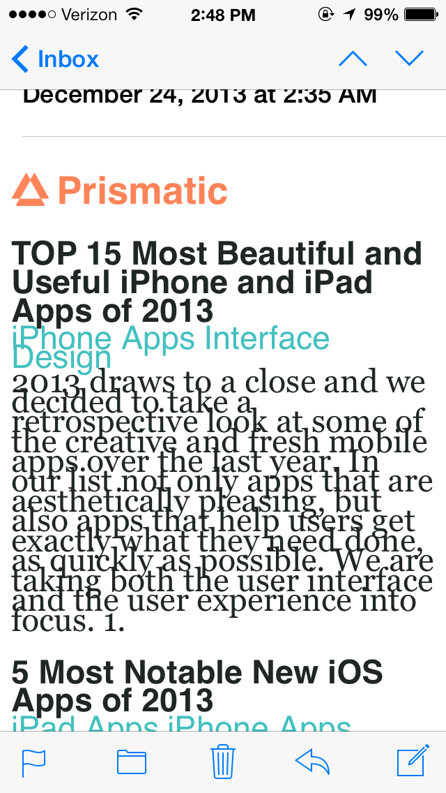
I don’t know if this particular problem is the fault of Dynamic Type or an issue with the Mail app and conflicting set fonts. The text in this e-mail is not the size font I specified in Dynamic Type but it is bigger than usual. Unfortunately the text is all smashed together so you can’t read a thing.
It is quite common for e-mails to force their own font types upon the recipient. Sometimes an e-mail from a friend is nice and big thanks to Dynamic Type, but sometimes a spam message or an ad from a company I do business with will force small typefaces down my throat… and SOMETIMES a website I have an account on will send me one of these messages where the text is all mashed together like in the image to the left.
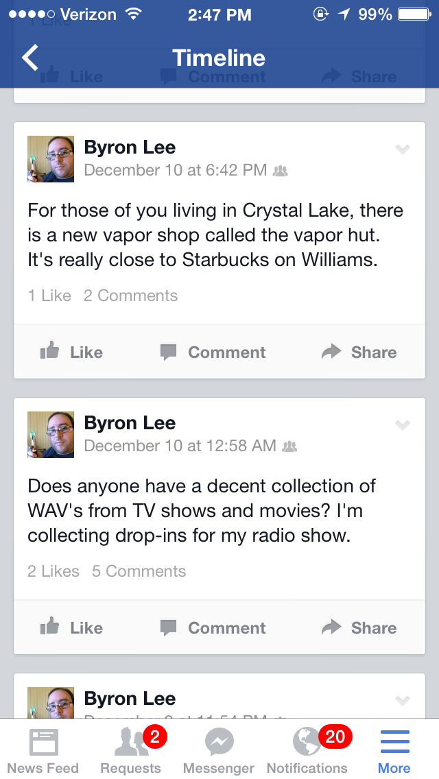
I hope this rant doesn’t leave you with the impression that I am ungrateful. I am so glad that Apple has implemented this feature and I hope more people start using it. Facebook is notorious for using teeny weeny fonts, as you will find in this picture. If they integrated Dynamic Type into their app it might make it much more usable.
But Facebook isn’t the only one who has apps that don’t use Dynamic Type at all. In fact, Apple’s App Store also has tiny fonts that most people with visual impairment wouldn’t be able to see no matter how hard they squinted.
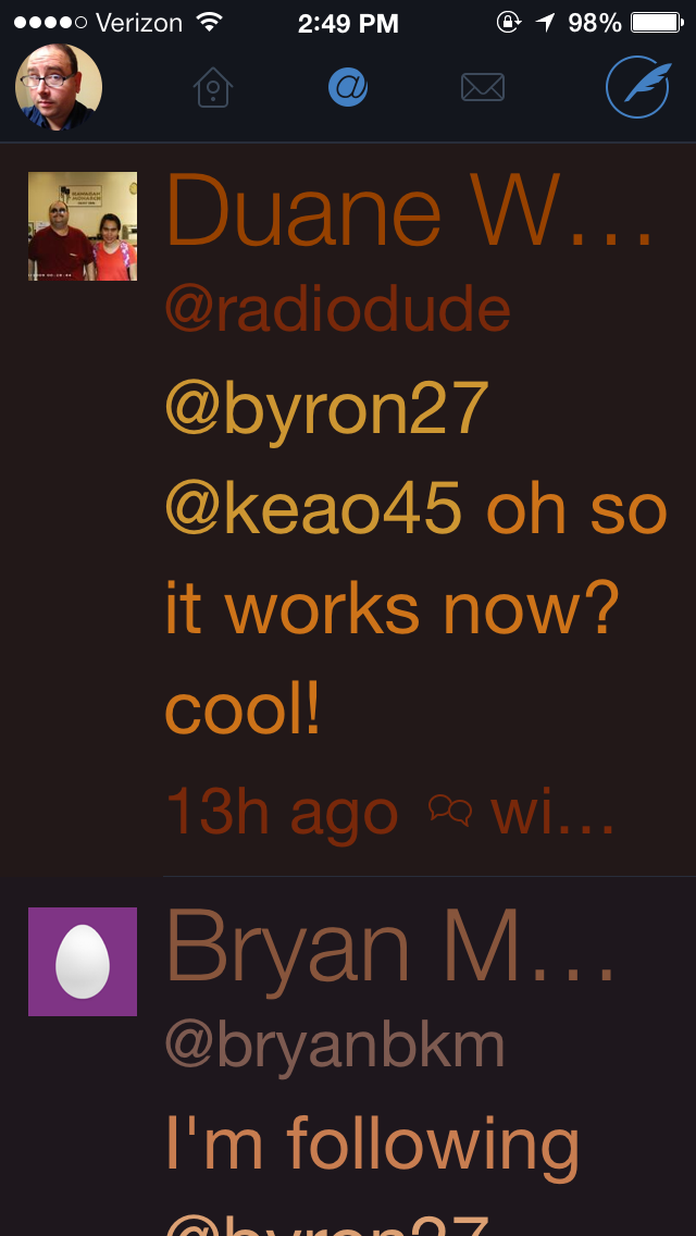
My last picture is one of Dynamic Type working beautifully with Twitterific, a really great Twitter app that every one of you visually impaired tweeple should own. It has a dark theme that you can use only at nigh or all the time if you wish. The text color contrast very nicely with the dark background. This is (in my case) the way apps for people with low vision should look and feel!
Well, that’s about all I had to say about Dynamic Type, let’s hope it gets better soon. If anyone has any suggestions on how to make things easier to see in iOS, please feel free to leave a comment below.
Another app on iOS that fails at dynamic type is pandora radio set dynamic type to it’s biggest setting and everything smashes together.
I had to use Pandora for a party last week and noticed the problems with Dynamic Type. Sometimes it causes more harm than good. Oh well!