Blog

Samsung’s TouchWiz Not So Bad For Low Vision Users

Android Wearing Glasses

So, I am not a great big fan of extra fluff being pre-installed on my mobile devices by the manufacturer or carrier. Things like “customized skins” or “additional layers” always seemed to take away from the Googleyness of Android. I prefer to use the vanilla version of things, this is why I originally got a Nexus 7 tablet back in 2012. My recent experiences may have changed my mind on this issue.

I recently took part in a panel discussion podcast for NCBI Technology about Low Vision. An overwhelming number of the panelists use Samsung Galaxy phones or tablets. They kept singing the praises of the TouchWiz interface from Samsung.

I rolled my eyes and scoffed at these people who thought some crappy molestation of the pure Android experience was somehow better. To be fair, I had never really spent much time with a Samsung device before.

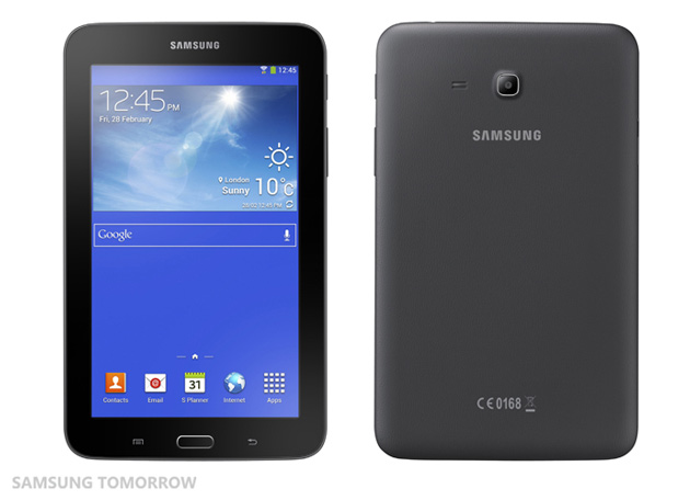
I decided to buy a Samsung Galaxy Tab 3 Lite to see if I would “throw up in disgust” or “drink the kool-aid” and join the Samsung Cult. A trip to Best Buy and $160 later, I had the device in hand.

Galaxy Tab 3 Lite
Galaxy Tab 3 Lite

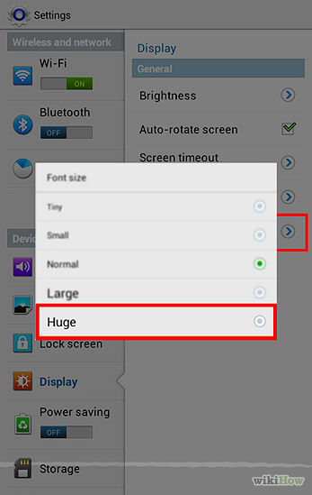
While my credit card may be weeping, I am gleefully smiling and I’ll tell you why! Samsung has added a few things to the Android Experience that make it that much easier to use. For example, you can select “Huge” in the font section instead of just “Large.” This makes a considerable difference to a person with limited vision.

Huge Font
Huge Font

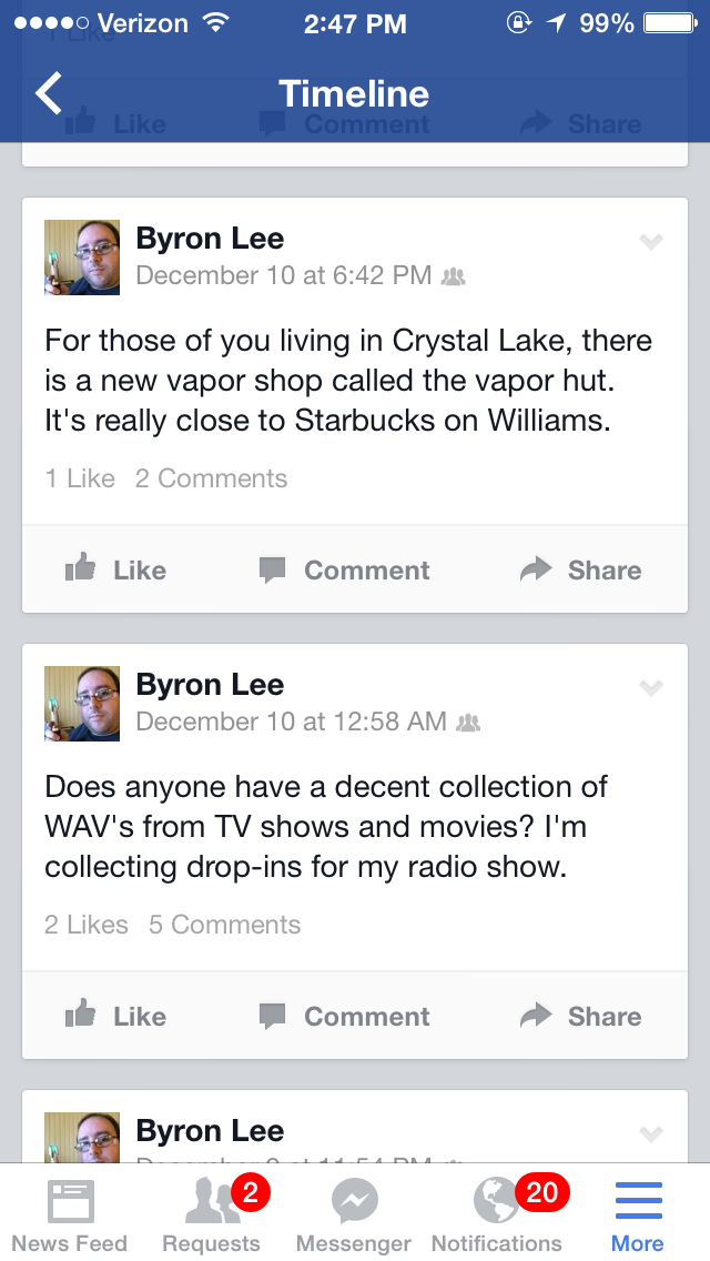
There are still parts of the OS that simply can’t obey the System Font rules, such as Facebook (bane of my existence!) but the Settings menu and much of the rest of the system will be much easier to see.

You can also check a box that says Increase legibility to enhance the clarity of the text, I didn’t notice a difference but you might.

Samsung has also added the ability to invert the colors so you can achieve high contrast, which is a must for some low vision users. There’s a downside to using this feature though. You may have a hard time seeing icons or pictures when the color is inverted as it flips the colors throughout the entire system.

The Zoom option which is not specifically a Samsung feature is really great! I have enough vision to not need to use magnification full time but there are moments where I can’t quite see whats going on. This is when I invoke a one-finger triple tap and hold on the screen to temporarily zoom in. As soon as I lift my finger, my view shoots back to normal. I can also do a one-finger triple tap without holding to get magnification on a more permanent scale. The way Zoom works on Android is loads better than how iOS does it.

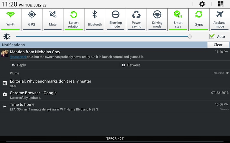
Sometimes the little things Samsung does helps a lot. For instance, the big ole’ icons in the Notification Shade seem bigger and easier to read to me.

Notification Shade
Notification Shade

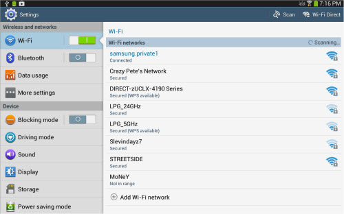
The settings menu seems more straightforward and intuitive as well, those big ole’ toggle switches are also quite easy to spot.

Samsung Settings
Samsung Settings

Android 4.2.2 Jelly Bean has introduced the ability to enable or disable speech on the fly. This is a great addition for those of us who might need speech some of the time, but not all of the time. This is not a Samsung Specific feature but the Talkback gestures somehow seem easier to perform on my Samsung device. The Nexus 7 always seemed sluggish and slow when trying to enter navigational menus in Talkback.

Simply draw an L on the screen by swiping one finger down and then to the right. A circle on the center of your screen will appear, along with a couple of half circles in the upper corners of your screen. The half-circle on the upper left is entitled “pause feedback.” This temporarily disables Talkback until you either re-enable it from the notification shade or lock and unlock the screen again.

The text-to-speech engine that comes with Samsung Galaxy devices by default sounds pretty natural, but it is not without its mispronunciation issues. I tend to flip between the Samsung High Quality Female and Male Voices and the Google TTS depending on what I am doing.

I did some things recommended by Jeffrey Stark to make my Android easier to see. I am using the Starfield Live Wallpaper to give me a dark background so icons and text are easier to see. Unfortunately, Samsung made some poor decisions on their default lock-screen artwork and it is very hard to see what’s happening until you change it to a wallpaper with a solid color or at least a more neutral image.

There are other things that Samsung has done to improve the overall experience for a low vision person. Many of these touches are hard to spot, but something about the design of TouchWiz just soothes my aching eyeballs and makes using a Samsung device a bit easier than stock Android.

Do you have a Samsung Galaxy device and love what they’ve done for people with low vision? Do you HATE TouchWiz and wish it would go die in a fire? Leave your comments below and let me know what you love or hate about Samsung OR Android.

You’re Invited!–Low Vision Devices and Medicare–Joint ACB/AFB Teleseminar Sponsored by HumanWare: March 12, 3pm ET

Ray Campbell of the Illinois Council of the Blind made me aware of this event. I’ll hopefully be present, will you? Check this out!

YOU'RE INVITED!
Making it Clearer: Medicare Coverage of Low Vision Devices Pending
Legislation, Policy Implications, and What You Can Do About It

A Free Teleseminar Jointly Hosted by:

The American Foundation for the Blind

and

The American Council of the Blind

Wednesday, March 12, 2014, 3:00 p.m., Eastern

***Sponsored by HumanWare***

For further information, contact: 

Mark Richert, Esq.
Director, Public Policy, AFB
(202) 469-6833
MRichert@afb.net 

You are invited to participate in a free national teleseminar jointly hosted
by ACB and AFB to learn about recent activities in the U.S. Congress to
promote Medicare coverage of low vision devices. We are grateful to
HumanWare, www.HumanWare.com, a global leader in low vision and other
assistive technologies, for their gracious support which is making this
teleseminar possible.

There is no need to register or RSVP for this free teleseminar. To join the
call, simply dial the toll-free number below at least ten minutes prior to
the March 12, 3pm Eastern, start time. Dial:

1-866-939-3921

Tell the operator that you are joining the "low vision devices" call.

We look forward to a lively discussion with all who are interested in
advancing the cause of Medicare coverage for low vision devices and other
assistive technologies. During the teleseminar, topics to be covered will
include pending legislation in Congress, the array of policy implications of
a permanent change in the Medicare program, and how advocates can
participate in the policy process.

Background

For decades, the vision loss community has been advocating for Medicare's
coverage of assistive technologies, particularly low vision devices.
Currently, Medicare will not pay for any device that happens to use a lens,
regardless of whether such device incorporates any other features. The
Centers for Medicare and Medicaid Services (CMS), the federal agency
responsible for the management of Medicare, has ruled that devices, such as
low vision devices, that use a lens are excluded from coverage just as are
eye glasses or contact lenses except in very narrow circumstances.

Now, for the first time, federal legislation would begin to change this
unacceptable national policy by establishing a nationwide Medicare
demonstration project to evaluate the fiscal impact of a permanent change in
Medicare coverage to pay for low vision devices. The legislation, H.R. 3749,
introduced by Reps. Carolyn Maloney (D-NY) and Gus Bilirakis (R-FL), would
initiate a five-year demonstration project that would put low vision devices
in the hands of Medicare beneficiaries who, after a clinical evaluation by
an ophthalmologist or optometrist, can benefit from a low vision device and
for whom such devices are medically necessary. The legislation is careful to
require that the demonstration project be genuinely national in scope and is
explicitly designed to yield reliable data and meaningful results. Once the
legislation is enacted and the demonstration project is successfully
completed, Congress will have significantly richer data upon which to
consider changes to the Medicare program to make coverage of low vision
devices, especially the most costly devices, a permanent feature of the
program. Precisely how many individuals will receive low vision devices and
how many physicians across the country will participate in the demo project
will need to be determined by CMS, working in consultation with stakeholder
groups, as it develops and implements the project. The legislation makes
$12.5 million available for the project over five years.

Advocates are encouraged to contact your members of the U.S. House of
Representatives and urge them to co-sponsor H.R. 3749. We are actively
working on Senate champions and will keep you updated as progress is made.
Thank you for your advocacy!

Live Extra Sucks

Is anyone else using Live Extra from NBC to follow the Olympics?  I have been, and don’t mind using it on my iDevice even if I can‘t see the screen because the audio is so good.

However, when I use it it jumps to commercials right in the middle of live production. What a piece of garbage. NBC, you have really failed with this one. I am probably going to scrap it because it is so useless. I am disappointed that a company like NBC would put such a piece of junk out for distribution.

Vinux There is a Linux Distribution for the Visually Impaired

The Vinux Project is a distribution of Linux based on the Ubuntu Distribution providing a user experience with accessibility in mind.  The Vinux distribution features magnification software and a high contrast desktop by default.  The distribution also features Text to Speech, Braille support and many other features.  You can download Vinux at the project website: http://vinuxproject.org/

The easiest way to experience Vinux is to download the live CD which can be burned to a 750MB CD and booted.  It is a fully functional operating system for you to play around with.  If you like what you see you can partition your drive and run a dual boot computer but if you do not want to do this you can create a virtual machine and use Vinux that way.

I personally use VirtualBox for most of my virtual machines.  It is free and can be downloaded here: https://www.virtualbox.org/

The VirtualBox GUI can be difficult to use with some screen readers but the great thing about VirtualBox is that you can create a VM directly from the command line.

I realise this is a short post and contains basic information but if there is any interest in running Vinux I will be happy to answer any questions or creating more blog posts on the topic.

Janetter: A Pretty Decent Twitter Client

Ever since I discovered social networking website Twitter, I’ve been on the hunt for a client for the Windows desktop that didn’t blow lemon pledge scented chunks all over the wood grain of my computer desk. Many of the top rated clients had one fatal flaw that made them about as useful as a fart in a spacesuit…

…the inability to change the font size!

Why is it so friggin’ difficult for developers to understand that not everyone has 20/20 vision… in fact most of us probably don’t see perfectly.
It has gotten ridiculous as of late, not only are some of these apps using pretty small font but they’re going beyond the typical standard for average text size and making everything even smaller to cram more feeds onto one screen!

I had just about resolved myself to a fate of chronic eye-strain when I discovered this highly customizable Twitter client called Janetter!

Janetter for Sighted People

At first glance you might think “Yuck, it looks like a rainbow barfed all over someone’s monitor.” I thought the same thing when I saw the pictures from the developer’s website. I downloaded it anyway and after I did some tweaking I made it look like THIS!

Janetter for Blinks
Janetter for Blinks

For security reasons I am not showing the 3rd column which is my DM’s. Also, I am not showing the columns for my additional accounts, just my main profile.

If you click on the images you’ll get a much clearer picture of what I’m talking about here. The downside is that Janetter is not accessible to speech users. If you are like me and have occasional eye fatigue you might have problems with this. I’d recommend using a speech specific Twitter client like Chicken Nugget or Socializer when you can’t deal with monitor glare.

We’ll talk about other ways I access Twitter in a future blog, I hope you find this posting useful. If so, post your comments below and sign up to be a participant in the forum for further discussion.

Excuse Me… Miss?

A cartoon of the back of a guy with long hair.

How many times has this happened to you? You are at a grocery store and you need a pair of eyeballs to read something for you. There’s a woman with long brown hair facing away from you at the end of the aisle. As you start walking toward her you say very distinctly “Excuse me… Miss?” The person you thought was a woman turns around and says very intimidatingly “SIR!” You shrink away in horror as the long-haired man with a big bushy biker beard starts frothing at the mouth.

I have had things like this happen to me on numerous occasions. At the time it happens I am humiliated beyond belief. Curling up in the fetal position sometimes sounds like just the thing to do. But looking back I gotta laugh at all those cases of (Miss Identification) BA-DUM-BUMP!

One of my favorite low-vision flubs of all time is the day I walked up to a mannequin and touched it. Suddenly this plastic statue comes to life and slaps me across the face and screams. I had a hard time explaining that one to her husband! No, he didn’t have long hair! 🙂

There’s a great episode of Sterotek’s High Contrast Podcast where we talk about confusing people’s genders among a ton of other amusing content. Check it out! Listen to High Contrast 13: Too Cool For School.

Tell us your war stories in the comments section below or post one in our Forums!

A Great Blog from Jeffrey Stark

Jeffrey Stark who goes by the username @lordjeff on Twitter has written a great 2-part series called “The quest for a high contrasting black mobile phone experience for low vision users”. You should really read this if you own or are considering getting an Android smartphone. It almost makes me wish I still had one so I could try all of the great tips and tricks he describes here.

The quest for a high contrasting black mobile phone experience for low vision users – Part 1.

The quest for a high contrasting black mobile phone experience for low vision users – Part 2.


Where iOS 7’s Dynamic Type Works and Where It Fails

As a low vision user of an Apple iPhone, I was very excited when I heard about Dynamic Type being included in iOS 7. As soon as it came out I immediately tested it out and was both disappointed and pleased. Dynamic type works great in most applications but utterly fails in others. Also, many parts of iOS 7 totally ignore Dynamic Type and worse, many high-profile apps opt-out of including this functionality.

Reminders with Dynamic Type
Notes App with Dynamic Type

This is a picture of the Notes app using Dynamic Type. As you can see, it is using very large text for the List View. You will also notice that iOS has a tendency to cut text off if it’s too big to fit in its allocated space. Another disappointing aspect of Dynamic Type is that the buttons on the app as well as the Status Bar Items all appear at their default small size. Turning on Dynamic Type does not increase the size of all elements on iOS 7, just particular parts of apps such as List Views and Edit Fields.

PushOver App Dynamic Type FAIL
PushOver App Dynamic Type FAIL!

Dynamic Type also has numerous problems rendering text properly in certain circumstances. This becomes more apparent as we start exploring other apps. Here’s a picture of an app I recently downloaded called Pushover. It can take input from various sources and give me Push Notifications about them. For example, you can be sent a Push Notification if your home automation system detects that someone just turned on the light. The sump pump can send you an alert if the basement floods. If someone in the chat room mentions your name your phone will bleep at you. This app has a lot of potential but the developer messed up on the UI a bit. As you can see, the text is too big to fit within the defined space allocated by the developer.

This problem can be alleviated by decreasing font size until text fits properly on the screen. To do this, go to Settings, General, Accessibility, Text Size. Grab the slider and move it until you’ve found the middle-ground between viability and functionality.

Notification Center Today Tab

The Notification Center deals with Dynamic Type in a really weird way. On the left there’s a picture of the Today tab, you’ll notice that the text is nice and big. On the right, we have the All tab and the text is the default small size. Hey Apple… WHAT GIVES!? I for one find the inconsistency highly annoying. By the way, do try to ignore the Viagra spam in the picture on the right! 🙂

You will find the same inconsistency throughout the entire iOS infrastructure. It is almost as if Apple patched this feature in as an afterthought. I am really hoping that as newer versions of iOS become available we will start seeing improvements on these kinds of features.

Recently Apple has started taking accessibility very seriously but most of their work has been centered on people who are totally blind or those who prefer text-to-speech. The zoom feature also helps many of us who are partially sighted but it’s not my favorite way of using a device. I really prefer using a feature like Dynamic Type, even if it’s not completely usable.

E-Mail Dynamic Type FAIL!

I don’t know if this particular problem is the fault of Dynamic Type or an issue with the Mail app and conflicting set fonts. The text in this e-mail is not the size font I specified in Dynamic Type but it is bigger than usual. Unfortunately the text is all smashed together so you can’t read a thing.

It is quite common for e-mails to force their own font types upon the recipient. Sometimes an e-mail from a friend is nice and big thanks to Dynamic Type, but sometimes a spam message or an ad from a company I do business with will force small typefaces down my throat… and SOMETIMES a website I have an account on will send me one of these messages where the text is all mashed together like in the image to the left.

Facebook Fail
Facebook FAIL!

I hope this rant doesn’t leave you with the impression that I am ungrateful. I am so glad that Apple has implemented this feature and I hope more people start using it. Facebook is notorious for using teeny weeny fonts, as you will find in this picture. If they  integrated Dynamic Type into their app it might make it much more usable.

But Facebook isn’t the only one who has apps that don’t use Dynamic Type at all. In fact, Apple’s App Store also has tiny fonts that most people with visual impairment wouldn’t be able to see no matter how hard they squinted.

Dynamic Type on Twitterific

My last picture is one of Dynamic Type working beautifully with Twitterific, a really great Twitter app that every one of you visually impaired tweeple should own. It has a dark theme that you can use only at nigh or all the time if you wish. The text color contrast very nicely with the dark background. This is (in my case) the way apps for people with low vision should look and feel!

Well, that’s about all I had to say about Dynamic Type, let’s hope it gets better soon. If anyone has any suggestions on how to make things easier to see in iOS, please feel free to leave a comment below.

My Experience With Windows 8.1

I’ve been using iOS and Android devices quite a bit over the last few years, and one thing I’ve become frustrated with is the lack of productivity achievable on these portable machines. They are great for consuming media but horrible for creation! Apple and Google would like you to think otherwise but it is simply too difficult to get anything done with such crippled software. Apple imposes limitations to save battery power or protect the user, and Android simply doesn’t have the apps that I need for producing content. This is why I got excited when I heard about the newest advancement in mobile computing.

I started hearing about these Tablets that have a full version of Windows 8.1 running on them. My thought was “Finally, a device that could fit into a coat pocket or small bag that would run all of my critical apps while on the road!”

I immediately started watching YouTube videos, reading reviews, and browsing user forums to find out everything I could about these modern marvels. I was really excited about finally having a real system with me at all times that could do everything from watch Netflix to producing an internet radio show.

My initial thought was to go with a small tablet like the Dell Venue 8 Pro or the Lenovo Miix 2 8. Both of these machines are small enough to carry on my person. I initially didn’t want to go with a 10-inch tablet because that would mean carrying a bag of some sort. However, after much thought I decided against the tiny 8-inch form-factor. My reasoning was that I would want a mouse and keyboard, hence I would still need a bag. Also, since I am visually impaired a bigger screen would make it much easier to see what I was doing… or so I thought.

To make a long story short, I wound up buying the Asus Transformer T100. This 10-inch machine has a detachable Keyboard Dock with built-in Trackpad, which negates having to carry around a Bluetooth Keyboard and Mouse. I could also detach the screen and hold it up to my face when something was too small to see.

I went to Best Buy; otherwise known as Broke Guy, and tried out the Transformer. I should have known as soon as I walked in the door that Windows 8.1 was not going to work out for me.

The first thing I looked at was the Modern UI, which has colored tiles that give you live feedback from many of your apps. The text was tiny, nearly impossible to read. So, we set to try and increase the size of the text and icons inside the Modern UI.

I found that if you go to the Charms Bar, Settings, Change PC Settings, PC & Devices, then Display, there is an option to “Change the size of apps on the display that can support it.” You should be able to click a drop-down box that allows you to select Large. If you are unlucky like I was, you’ll find that your display will be too low of a resolution to allow you to change this option.

So, the Modern UI was not changeable in any meaningful way, which really upset me. So, I thought what if we changed the DPI scailing so that everything appeared bigger?

To do this, click on the Desktop tile. Now, right click on the background image and click on Screen Resolution. You will find an option that says “Make text and other items larger or smaller.” At this point you can select from a list of size percentages or create a custom DPI scailing setting.

We tried it at %200 which was still pretty small, but doable with my particular vision acuity. We tested at even higher settings but eventually text and dialog boxes would no longer fit on the screen if you make things too large. The downside to this victory is that the Modern UI appeared unchanged after modifying the DPI scailing!

This is when I started getting pissed off! How could Microsoft leave people with poor eye-sight out in the cold like this!? You might say, “But Byron, we’re not forgotten because we have the Ease of Access Center.”

Okay, so now I go into the Charms menu and click on Settings, then Ease of Access and turn on the magnifier. I would be lying if  I said this experience was pleasant.

The magnifier draws a semi-transparent grey frame all around the screen, with a + in the upper left and right corners and a – in the lower left and right corners. You are supposed to adjust the magnification by clicking on the + or – signs and move your virtual camera around by clicking on the edges of the frame.

The frame they throw around the edges of the screen obscures everything, and the navigation system for controlling the magnifier simply sucks! I’ve never been a huge fan of screen magnification software but Microsoft really screwed this one up.

The other problem with my new Windows 8.1 tablet is that the keyboard was D.O.A. so I had to return it to Best Buy. I decided not to get another one because I was so pissed off with the terrible state of things on the Windows side. I ended up buying a MacBook Air because I’ve decided that Windows probably won’t be getting any better in the future.

Windows has been getting worse and worse for people with low vision since the introduction of Vista. I remember back in the days of XP it wasn’t very hard to change the system font to Arial Black and use the Extra Large theme to increase the size of menus and buttons. But now they have neutered Windows so much it isn’t even possible to modify how things look anymore.

Perhaps if I had stuck it out and gotten a replacement keyboard, I would have found ways to adapt to the changes as I always have had to do. It could be that using Classic Shell would have been a good alternative to the Modern UI. Maybe I should have considered getting 3rd party magnification software.

What do the rest of you think? Is Windows frustrating you with lack of support? Have they finally lost those of us who don’t care about eye candy? What will you buy when it’s your turn to upgrade?