Windows 10 Magnifier – A First Look


For those of you who hadn’t heard yet the Windows 10 Technical Preview is available to the general public as of earlier this week. For information about how to get a copy of and install the technical preview check out Paul Thurrott’s on going articles on Winsupersite.com he also is a co-host of Windows Weekly Podcast on the TWiT Network. After downloading the 64-bit version of the Windows 10 Technical Preview I set out upon the epic journey of creating a virtual machine environment to install it into. In this particular case this would allow me to run Windows 10 on a Mac and run OS X at the same time; which I’m doing at the same moment as I’m writing this article. It worked out great for me. I had the benefit of using Mac’s Zoom feature while manipulating and running the Windows 10 installer; which simply appears as another window in OS X. If your interested in trying this out and you’re like me, not having a spare PC lying around, check out this handy article on LifeHacker about how to use VirtualBox to try out Windows 10. Hey its free by the way!

Ok, now for what you really wanted to know! What’s up with Windows Magnifier? Well to tell you the truth the interface looks exactly the same to me. First let me say I’m primarily a low-vision software user; day-to-day I use Mac’s Zoom and ZoomText on my Windows 7 PC. I also can’t get by without Inverted Colors or some equivalent High-Contrast mode. Now with that out of the way let me tell you about running Magnifier on Windows 10. So from the Start Menu…. Yes, that’s right, I said “Start Menu” its back baby! I opened the Run Command dialog box and simply typed in “magnify” and it launched as always. By default it launched at 200% magnification or 2x, so if you’re like me you’ll need to bump up the magnification quite a bit. You can do this using the same keyboard combination that you’ll find on Windows 7 systems. (To increase or decrease magnification press Windows Key + the plus or minus keys accordingly.)

win10tp_magnfier_transparent_mag
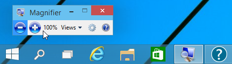
Here’s a picture of the translucent magnifying glass we’re familiar with from as far back as Windows 7. Oh by the way, in addition to starting at 200% Zoom, Magnifier also starts up in “Full Screen” mode just like it typically does on Windows 7 systems.

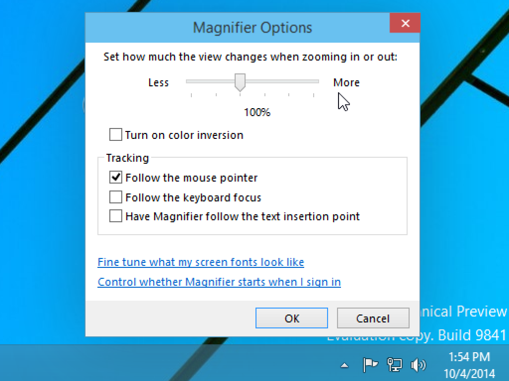
The Windows Magnifier seems to have all the core features of the older version we’d find on a Windows 7 system. The maximum zoom level goes up to 1600% or 16x, it has an “Invert Colors” Mode, and apparently the same rudimentary tracking features. Under “Tracking” in the Settings drop-down you see the three following options: “Follow the mouse”, “Follow the Keyboard focus”, and “Have Magnifier follow the text insertion point”. Here’s a screenshot of Windows 10 Magnifier settings panel, which undoubtedly looks familiar.

win10tp_magnifier
Here’s a screenshot of Windows 10 Magnifier settings panel, which undoubtedly looks familiar.

I guess the real test will be using it in a real world work environment over a more extended period of time. In the past I’ve found Magnifier, on Windows 7, to be… let’s say… not the greatest experience. Don’t get me wrong it’s a thousand times better than it was in previous iterations, back when it was a lens and you didn’t even have a full screen option. But I’ve never used it as a workhorse for day-to-day activities. If you had to tweak or fix somebodies system on the fly it was great but otherwise I’d opt for ZoomText, especially if it required several hours on the system. My chief problems with Magnifier were its tracking ability and I’ve seen it get flaky at times if the CPU had a serious draw on it. So while the UI and features look the same on the new Windows 10 Magnifier I can’t speak to the reliability when the system is under a load or the tracking. For that I’ll need some more time with it. We here at Low Vision Rants will strive to keep you updated about Windows 10 Accessibility features as we learn more; and as new Betas are released from Microsoft.

About My Setup:

These screenshots and opinions are based on my experimenting with Windows 10 Technical Preview Build 9841. This install was made inside a Virtual Machine on Mac OS X (Version 10.9.4 Mavericks) using VirtualBox 4.3.16. My VM was allocated 2GB of RAM and a 25GB Hard Drive. The iMac I was using is an i5 Quad-Core 2.5Ghz box with 4GB of RAM. So far Windows 10 has run pretty smooth under these conditions. You can find me on Twitter if you have any further thoughts. (@Certdoctor)

Windows Phone 8.1 Low Vision Tools

Over the past few weeks I’ve been experimenting with a Nokia Lumia 520, that I bought off the Microsoft store. It is a prepaid AT&T model and only cost $59 (USD). My mission was to update it to the newest Developer release of the operating system version 8.1. This new release features Narrator; but I’m not going to talk much about that today. Instead I’ll be talking about the Low-Vision features that it provides.

Now I should mention that out of the box the phone has a system wide Magnifier and a High-Contrast mode. So this is prior to the update to 8.1.

So here’s the Low-Vision features you might find useful:

  1. Magnifier (System wide feature just like in Apple’s iOS. Not sure how big it will get; I’m guessing around 500%.)
  2. High-Contrast Theme (This feature is just what it sounds like but has some added advantages over Apple’s iOS in my opinion.)
  3. Text-Size (This is the ability to change many system level fonts across the entire phone.)
  4. An Internet Explorer Zoom Override (This feature allows you to zoom into web content even if the page or app usually wouldn’t allow you too. I don’t have a lot of experience trying this yet, but sounds fantastic.)

So that’s the core Low-Vision features. The Magnifier smoothly and quickly activates once enabled in the “Ease of Access” section under settings. Instead of a three-finger operation like on iOS it however is activated by two-fingers. And navigation is done using two fingers.

Rant: Here’s a problem you’ll find using it. While smooth and fast and the zoom level granularity is on par with iOS it is harder to navigate with. The core of the problem is panning; or moving the field of view around while zoomed in. On iOS you don’t even think about it but when you swipe with three fingers and release the panning generally continues with a certain level of momentum. So with a few quick swipes you can be anywhere on the screen. Not so on Windows Phone. Soon as you pull your two fingers off the screen the panning navigation stops. The result is you can’t get anywhere on the screen without making sure your fingers remain in contact with the screen while swiping. Once you get use to it its not that bad. But it strikes me that it takes longer to get anywhere and makes my navigation feel more laborious than I think it needs to be. Oh, an here’s another rant, you can’t run Magnifier and Narrator at the same time. Ok I’m done, let’s move on to something more positive.

Now I said before that the “High-Contrast” theme was a nice feature; even perhaps better than iOS. And here’s why; It doesn’t affect photos. That’s right. Your photos are not eerie reverse colored images out of some horror film. Additionally, High-Contrast seems to make the system level fonts pop out more than even turning up the brightness to maximum will. Additionally, “High-Contrast” seems to have been designed by someone who had some brains. For example: The settings menu by default is white lettering on a black or dark gray background. Now if this was iOS we all know what would happen. The settings menu would be black letters on a white background when High-Contrast was enabled; not so with Windows Phone. The settings menu remains white lettering on a dark background; an as I said the fonts are even brighter than normal. So well done Microsoft!

Well that’s it for now but I’ll be sure to follow up soon. If you’d like to hear an audio demo of Narrator being used to setup my phone check this out. If you have any questions feel free to contact me on Twitter (@Certdoctor).

Samsung’s TouchWiz Not So Bad For Low Vision Users

Android Wearing Glasses

So, I am not a great big fan of extra fluff being pre-installed on my mobile devices by the manufacturer or carrier. Things like “customized skins” or “additional layers” always seemed to take away from the Googleyness of Android. I prefer to use the vanilla version of things, this is why I originally got a Nexus 7 tablet back in 2012. My recent experiences may have changed my mind on this issue.

I recently took part in a panel discussion podcast for NCBI Technology about Low Vision. An overwhelming number of the panelists use Samsung Galaxy phones or tablets. They kept singing the praises of the TouchWiz interface from Samsung.

I rolled my eyes and scoffed at these people who thought some crappy molestation of the pure Android experience was somehow better. To be fair, I had never really spent much time with a Samsung device before.

I decided to buy a Samsung Galaxy Tab 3 Lite to see if I would “throw up in disgust” or “drink the kool-aid” and join the Samsung Cult. A trip to Best Buy and $160 later, I had the device in hand.

Galaxy Tab 3 Lite
Galaxy Tab 3 Lite

While my credit card may be weeping, I am gleefully smiling and I’ll tell you why! Samsung has added a few things to the Android Experience that make it that much easier to use. For example, you can select “Huge” in the font section instead of just “Large.” This makes a considerable difference to a person with limited vision.

Huge Font
Huge Font

There are still parts of the OS that simply can’t obey the System Font rules, such as Facebook (bane of my existence!) but the Settings menu and much of the rest of the system will be much easier to see.

You can also check a box that says Increase legibility to enhance the clarity of the text, I didn’t notice a difference but you might.

Samsung has also added the ability to invert the colors so you can achieve high contrast, which is a must for some low vision users. There’s a downside to using this feature though. You may have a hard time seeing icons or pictures when the color is inverted as it flips the colors throughout the entire system.

The Zoom option which is not specifically a Samsung feature is really great! I have enough vision to not need to use magnification full time but there are moments where I can’t quite see whats going on. This is when I invoke a one-finger triple tap and hold on the screen to temporarily zoom in. As soon as I lift my finger, my view shoots back to normal. I can also do a one-finger triple tap without holding to get magnification on a more permanent scale. The way Zoom works on Android is loads better than how iOS does it.

Sometimes the little things Samsung does helps a lot. For instance, the big ole’ icons in the Notification Shade seem bigger and easier to read to me.

Notification Shade
Notification Shade

The settings menu seems more straightforward and intuitive as well, those big ole’ toggle switches are also quite easy to spot.

Samsung Settings
Samsung Settings

Android 4.2.2 Jelly Bean has introduced the ability to enable or disable speech on the fly. This is a great addition for those of us who might need speech some of the time, but not all of the time. This is not a Samsung Specific feature but the Talkback gestures somehow seem easier to perform on my Samsung device. The Nexus 7 always seemed sluggish and slow when trying to enter navigational menus in Talkback.

Simply draw an L on the screen by swiping one finger down and then to the right. A circle on the center of your screen will appear, along with a couple of half circles in the upper corners of your screen. The half-circle on the upper left is entitled “pause feedback.” This temporarily disables Talkback until you either re-enable it from the notification shade or lock and unlock the screen again.

The text-to-speech engine that comes with Samsung Galaxy devices by default sounds pretty natural, but it is not without its mispronunciation issues. I tend to flip between the Samsung High Quality Female and Male Voices and the Google TTS depending on what I am doing.

I did some things recommended by Jeffrey Stark to make my Android easier to see. I am using the Starfield Live Wallpaper to give me a dark background so icons and text are easier to see. Unfortunately, Samsung made some poor decisions on their default lock-screen artwork and it is very hard to see what’s happening until you change it to a wallpaper with a solid color or at least a more neutral image.

There are other things that Samsung has done to improve the overall experience for a low vision person. Many of these touches are hard to spot, but something about the design of TouchWiz just soothes my aching eyeballs and makes using a Samsung device a bit easier than stock Android.

Do you have a Samsung Galaxy device and love what they’ve done for people with low vision? Do you HATE TouchWiz and wish it would go die in a fire? Leave your comments below and let me know what you love or hate about Samsung OR Android.

Vinux There is a Linux Distribution for the Visually Impaired

The Vinux Project is a distribution of Linux based on the Ubuntu Distribution providing a user experience with accessibility in mind.  The Vinux distribution features magnification software and a high contrast desktop by default.  The distribution also features Text to Speech, Braille support and many other features.  You can download Vinux at the project website: http://vinuxproject.org/

The easiest way to experience Vinux is to download the live CD which can be burned to a 750MB CD and booted.  It is a fully functional operating system for you to play around with.  If you like what you see you can partition your drive and run a dual boot computer but if you do not want to do this you can create a virtual machine and use Vinux that way.

I personally use VirtualBox for most of my virtual machines.  It is free and can be downloaded here: https://www.virtualbox.org/

The VirtualBox GUI can be difficult to use with some screen readers but the great thing about VirtualBox is that you can create a VM directly from the command line.

I realise this is a short post and contains basic information but if there is any interest in running Vinux I will be happy to answer any questions or creating more blog posts on the topic.

Janetter: A Pretty Decent Twitter Client

Ever since I discovered social networking website Twitter, I’ve been on the hunt for a client for the Windows desktop that didn’t blow lemon pledge scented chunks all over the wood grain of my computer desk. Many of the top rated clients had one fatal flaw that made them about as useful as a fart in a spacesuit…

…the inability to change the font size!

Why is it so friggin’ difficult for developers to understand that not everyone has 20/20 vision… in fact most of us probably don’t see perfectly.
It has gotten ridiculous as of late, not only are some of these apps using pretty small font but they’re going beyond the typical standard for average text size and making everything even smaller to cram more feeds onto one screen!

I had just about resolved myself to a fate of chronic eye-strain when I discovered this highly customizable Twitter client called Janetter!

Janetter for Sighted People

At first glance you might think “Yuck, it looks like a rainbow barfed all over someone’s monitor.” I thought the same thing when I saw the pictures from the developer’s website. I downloaded it anyway and after I did some tweaking I made it look like THIS!

Janetter for Blinks
Janetter for Blinks

For security reasons I am not showing the 3rd column which is my DM’s. Also, I am not showing the columns for my additional accounts, just my main profile.

If you click on the images you’ll get a much clearer picture of what I’m talking about here. The downside is that Janetter is not accessible to speech users. If you are like me and have occasional eye fatigue you might have problems with this. I’d recommend using a speech specific Twitter client like Chicken Nugget or Socializer when you can’t deal with monitor glare.

We’ll talk about other ways I access Twitter in a future blog, I hope you find this posting useful. If so, post your comments below and sign up to be a participant in the forum for further discussion.

A Great Blog from Jeffrey Stark

Jeffrey Stark who goes by the username @lordjeff on Twitter has written a great 2-part series called “The quest for a high contrasting black mobile phone experience for low vision users”. You should really read this if you own or are considering getting an Android smartphone. It almost makes me wish I still had one so I could try all of the great tips and tricks he describes here.

The quest for a high contrasting black mobile phone experience for low vision users – Part 1.

The quest for a high contrasting black mobile phone experience for low vision users – Part 2.


Where iOS 7’s Dynamic Type Works and Where It Fails

As a low vision user of an Apple iPhone, I was very excited when I heard about Dynamic Type being included in iOS 7. As soon as it came out I immediately tested it out and was both disappointed and pleased. Dynamic type works great in most applications but utterly fails in others. Also, many parts of iOS 7 totally ignore Dynamic Type and worse, many high-profile apps opt-out of including this functionality.

Reminders with Dynamic Type
Notes App with Dynamic Type

This is a picture of the Notes app using Dynamic Type. As you can see, it is using very large text for the List View. You will also notice that iOS has a tendency to cut text off if it’s too big to fit in its allocated space. Another disappointing aspect of Dynamic Type is that the buttons on the app as well as the Status Bar Items all appear at their default small size. Turning on Dynamic Type does not increase the size of all elements on iOS 7, just particular parts of apps such as List Views and Edit Fields.

PushOver App Dynamic Type FAIL
PushOver App Dynamic Type FAIL!

Dynamic Type also has numerous problems rendering text properly in certain circumstances. This becomes more apparent as we start exploring other apps. Here’s a picture of an app I recently downloaded called Pushover. It can take input from various sources and give me Push Notifications about them. For example, you can be sent a Push Notification if your home automation system detects that someone just turned on the light. The sump pump can send you an alert if the basement floods. If someone in the chat room mentions your name your phone will bleep at you. This app has a lot of potential but the developer messed up on the UI a bit. As you can see, the text is too big to fit within the defined space allocated by the developer.

This problem can be alleviated by decreasing font size until text fits properly on the screen. To do this, go to Settings, General, Accessibility, Text Size. Grab the slider and move it until you’ve found the middle-ground between viability and functionality.

Notification Center Today Tab

The Notification Center deals with Dynamic Type in a really weird way. On the left there’s a picture of the Today tab, you’ll notice that the text is nice and big. On the right, we have the All tab and the text is the default small size. Hey Apple… WHAT GIVES!? I for one find the inconsistency highly annoying. By the way, do try to ignore the Viagra spam in the picture on the right! 🙂

You will find the same inconsistency throughout the entire iOS infrastructure. It is almost as if Apple patched this feature in as an afterthought. I am really hoping that as newer versions of iOS become available we will start seeing improvements on these kinds of features.

Recently Apple has started taking accessibility very seriously but most of their work has been centered on people who are totally blind or those who prefer text-to-speech. The zoom feature also helps many of us who are partially sighted but it’s not my favorite way of using a device. I really prefer using a feature like Dynamic Type, even if it’s not completely usable.

E-Mail Dynamic Type FAIL!

I don’t know if this particular problem is the fault of Dynamic Type or an issue with the Mail app and conflicting set fonts. The text in this e-mail is not the size font I specified in Dynamic Type but it is bigger than usual. Unfortunately the text is all smashed together so you can’t read a thing.

It is quite common for e-mails to force their own font types upon the recipient. Sometimes an e-mail from a friend is nice and big thanks to Dynamic Type, but sometimes a spam message or an ad from a company I do business with will force small typefaces down my throat… and SOMETIMES a website I have an account on will send me one of these messages where the text is all mashed together like in the image to the left.

Facebook Fail
Facebook FAIL!

I hope this rant doesn’t leave you with the impression that I am ungrateful. I am so glad that Apple has implemented this feature and I hope more people start using it. Facebook is notorious for using teeny weeny fonts, as you will find in this picture. If they  integrated Dynamic Type into their app it might make it much more usable.

But Facebook isn’t the only one who has apps that don’t use Dynamic Type at all. In fact, Apple’s App Store also has tiny fonts that most people with visual impairment wouldn’t be able to see no matter how hard they squinted.

Dynamic Type on Twitterific

My last picture is one of Dynamic Type working beautifully with Twitterific, a really great Twitter app that every one of you visually impaired tweeple should own. It has a dark theme that you can use only at nigh or all the time if you wish. The text color contrast very nicely with the dark background. This is (in my case) the way apps for people with low vision should look and feel!

Well, that’s about all I had to say about Dynamic Type, let’s hope it gets better soon. If anyone has any suggestions on how to make things easier to see in iOS, please feel free to leave a comment below.

My Experience With Windows 8.1

I’ve been using iOS and Android devices quite a bit over the last few years, and one thing I’ve become frustrated with is the lack of productivity achievable on these portable machines. They are great for consuming media but horrible for creation! Apple and Google would like you to think otherwise but it is simply too difficult to get anything done with such crippled software. Apple imposes limitations to save battery power or protect the user, and Android simply doesn’t have the apps that I need for producing content. This is why I got excited when I heard about the newest advancement in mobile computing.

I started hearing about these Tablets that have a full version of Windows 8.1 running on them. My thought was “Finally, a device that could fit into a coat pocket or small bag that would run all of my critical apps while on the road!”

I immediately started watching YouTube videos, reading reviews, and browsing user forums to find out everything I could about these modern marvels. I was really excited about finally having a real system with me at all times that could do everything from watch Netflix to producing an internet radio show.

My initial thought was to go with a small tablet like the Dell Venue 8 Pro or the Lenovo Miix 2 8. Both of these machines are small enough to carry on my person. I initially didn’t want to go with a 10-inch tablet because that would mean carrying a bag of some sort. However, after much thought I decided against the tiny 8-inch form-factor. My reasoning was that I would want a mouse and keyboard, hence I would still need a bag. Also, since I am visually impaired a bigger screen would make it much easier to see what I was doing… or so I thought.

To make a long story short, I wound up buying the Asus Transformer T100. This 10-inch machine has a detachable Keyboard Dock with built-in Trackpad, which negates having to carry around a Bluetooth Keyboard and Mouse. I could also detach the screen and hold it up to my face when something was too small to see.

I went to Best Buy; otherwise known as Broke Guy, and tried out the Transformer. I should have known as soon as I walked in the door that Windows 8.1 was not going to work out for me.

The first thing I looked at was the Modern UI, which has colored tiles that give you live feedback from many of your apps. The text was tiny, nearly impossible to read. So, we set to try and increase the size of the text and icons inside the Modern UI.

I found that if you go to the Charms Bar, Settings, Change PC Settings, PC & Devices, then Display, there is an option to “Change the size of apps on the display that can support it.” You should be able to click a drop-down box that allows you to select Large. If you are unlucky like I was, you’ll find that your display will be too low of a resolution to allow you to change this option.

So, the Modern UI was not changeable in any meaningful way, which really upset me. So, I thought what if we changed the DPI scailing so that everything appeared bigger?

To do this, click on the Desktop tile. Now, right click on the background image and click on Screen Resolution. You will find an option that says “Make text and other items larger or smaller.” At this point you can select from a list of size percentages or create a custom DPI scailing setting.

We tried it at %200 which was still pretty small, but doable with my particular vision acuity. We tested at even higher settings but eventually text and dialog boxes would no longer fit on the screen if you make things too large. The downside to this victory is that the Modern UI appeared unchanged after modifying the DPI scailing!

This is when I started getting pissed off! How could Microsoft leave people with poor eye-sight out in the cold like this!? You might say, “But Byron, we’re not forgotten because we have the Ease of Access Center.”

Okay, so now I go into the Charms menu and click on Settings, then Ease of Access and turn on the magnifier. I would be lying if  I said this experience was pleasant.

The magnifier draws a semi-transparent grey frame all around the screen, with a + in the upper left and right corners and a – in the lower left and right corners. You are supposed to adjust the magnification by clicking on the + or – signs and move your virtual camera around by clicking on the edges of the frame.

The frame they throw around the edges of the screen obscures everything, and the navigation system for controlling the magnifier simply sucks! I’ve never been a huge fan of screen magnification software but Microsoft really screwed this one up.

The other problem with my new Windows 8.1 tablet is that the keyboard was D.O.A. so I had to return it to Best Buy. I decided not to get another one because I was so pissed off with the terrible state of things on the Windows side. I ended up buying a MacBook Air because I’ve decided that Windows probably won’t be getting any better in the future.

Windows has been getting worse and worse for people with low vision since the introduction of Vista. I remember back in the days of XP it wasn’t very hard to change the system font to Arial Black and use the Extra Large theme to increase the size of menus and buttons. But now they have neutered Windows so much it isn’t even possible to modify how things look anymore.

Perhaps if I had stuck it out and gotten a replacement keyboard, I would have found ways to adapt to the changes as I always have had to do. It could be that using Classic Shell would have been a good alternative to the Modern UI. Maybe I should have considered getting 3rd party magnification software.

What do the rest of you think? Is Windows frustrating you with lack of support? Have they finally lost those of us who don’t care about eye candy? What will you buy when it’s your turn to upgrade?